

 EN

 CN
 ES

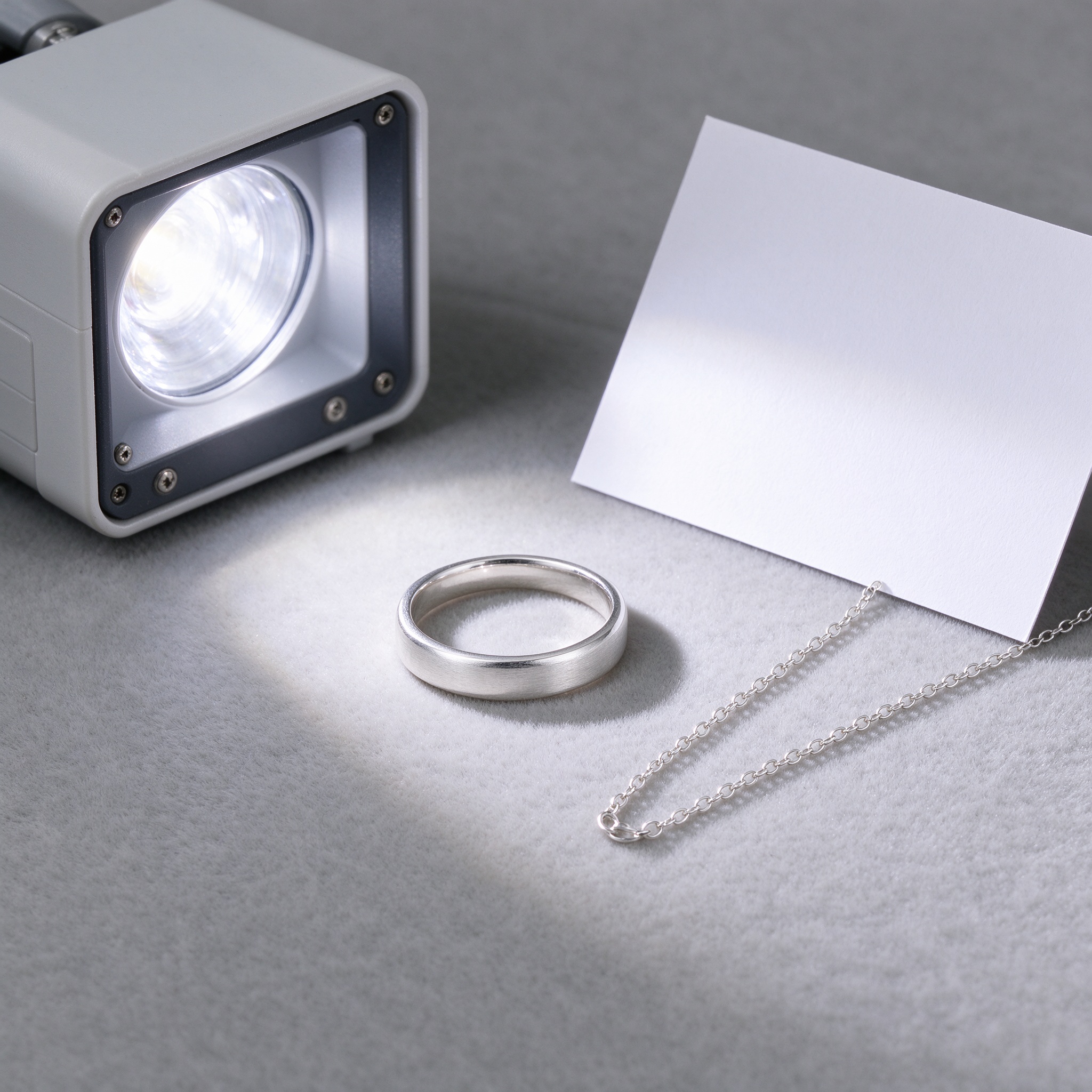
The starting kit is modest: a current phone with optical stabilisation, a softbox or white shoot-through umbrella around 40 cm, a sheet of white card as a reflector, a light grey or cream felt background, and a stand to hold the phone. A camera is better but not required; the phone limits background compression and minimum focus distance, which an add-on macro lens or a crop solves for detail shots. Light placement and background decide the result, not the body price. Do not buy a flash first: hard on-camera shadows are the worst thing you can do to silver.
Silver is close to a mirror, so direct light produces a blown specular patch that erases texture and form. Make the source large and soft: softbox, shoot-through umbrella, or simply a north-facing window. The test is simple: look at the metal for a gradient. A dead white patch means the light is too hard; a soft transition band means diffusion is working. A second trick is a white card opposite the key light to lift the shadow side, otherwise the back of a silver piece falls into a black mass.
The most reliable setup is a single key at about 45 degrees with a reflector opposite: the key builds form, the reflector controls contrast. Place the key slightly above so shadows fall below the piece; keep the reflector at about one third of the key-to-subject distance, closer becomes flat fill. For rings, stand a card through the band to create depth inside the circle. For necklaces, avoid evenly spaced specular dots along the chain; rotate the piece slightly so the highlight travels along the links instead of parking on one point.
Highlights are a framing problem solved by angle. Fingerprints are a handling problem: wear cotton gloves, wipe with a lint-free cloth before shooting, and never grip the face of the piece. Scratches are existing flaws best avoided with light, positioning the key so the scratch does not reflect, which is cheaper than retouching. One more trap is tarnish: if the piece has yellowed, clean it first, or you will spend several times as long in colour correction. For volume, batch by category, all rings first, then necklaces, to avoid re-lighting repeatedly.
Marketplace main images are usually 1:1; detail shots work at 1:1 or 4:3; lifestyle at 3:4 or 16:9. The first main image must be complete, centred and clean, with no prop clutter. The second shows a macro detail such as clasp, stamp or setting. The third shows wear or use. All images of one design must come from one lighting setup, or colour and brightness jump in the listing. Keep the short edge at 1000 pixels or more, and add no borders or text to main images; many platforms reject them outright.
Yes. Diffusion and background matter more than the body. A softbox or window light plus a white card is enough for main images; add macro for details.
Usually the light is too diffuse and contrast is low, or the background is grey too. Add a white card to lift shadows, or move to a cream or light grey background.
No, and it is better not to. Over-retouching kills metal texture. Solve scratches with light angles, fix only obvious flaws, and leave texture and structure alone.
Three to five main images: full front, macro detail, wear or lifestyle, packaging, and a size reference. Keep one lighting setup for consistent colour across the listing.


